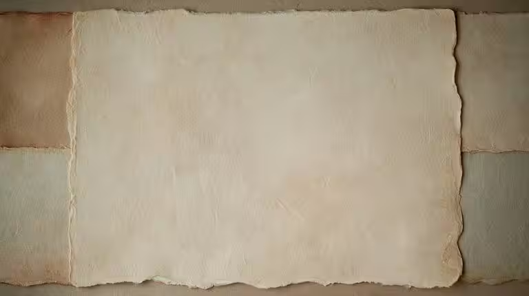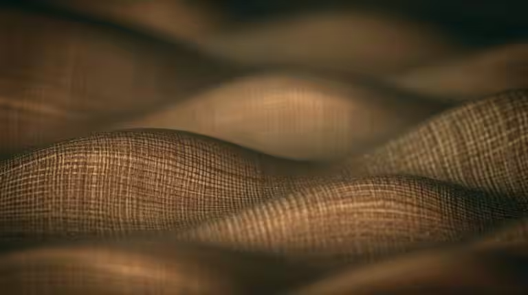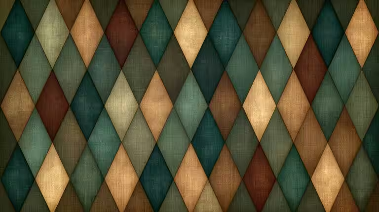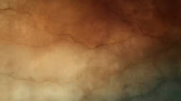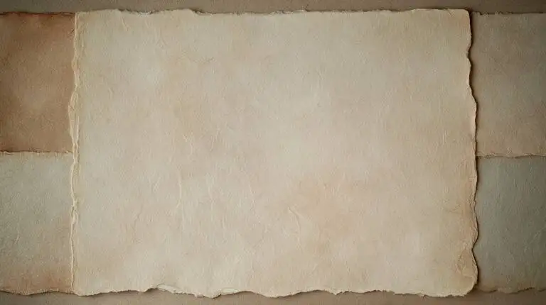
Paper fiber
Warm cellulose grain. Reading surfaces that want to stay put.
data-spw-texture-slice="paper"
texture.website
Materials and patterns as page feeling. The proving ground is spwashi.com; this host is the grain lab.
These four tiles are the live data-spw-texture-slice families. The token is on each card.
Warm cellulose grain. Reading surfaces that want to stay put.
data-spw-texture-slice="paper"
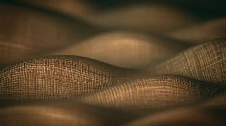
Crossed threads. Cloth memory under illustration.
data-spw-texture-slice="linen"
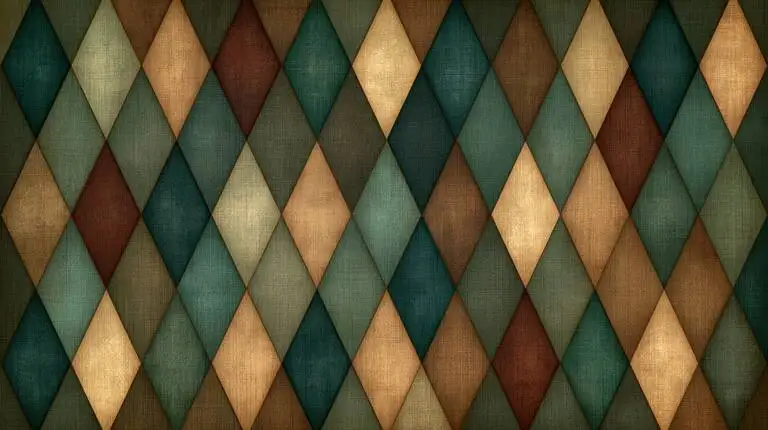
Play lattice. Pattern that can carry a scene without becoming a costume.
data-spw-texture-slice="harlequin"
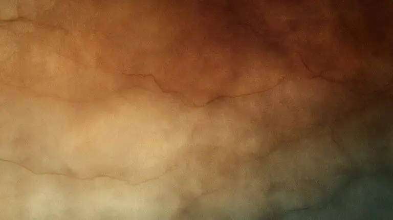
Thin pigment on paper. A field, not a fill.
data-spw-texture-slice="wash"
Write a sentence here. The grain should carry it, not sit on top of it.
Save the tile beside your stylesheet and paste the rule. Free for personal and study use with credit to texture.website. Commercial use by commission.
.texture-paper {
  background-color: #c4a574;
  background-image: url("texture-paper-fiber-display.webp");
  background-size: cover;
  background-position: center;
}Then <div class="texture-paper">…</div>
.texture-linen {
  background-color: #b8ad98;
  background-image: url("texture-linen-weave-display.webp");
  background-size: cover;
  background-position: center;
}Then <div class="texture-linen">…</div>
.texture-harlequin {
  background-color: #5b4a6b;
  background-image: url("texture-harlequin-diamonds-display.webp");
  background-size: cover;
  background-position: center;
}Then <div class="texture-harlequin">…</div>
.texture-wash {
  background-color: #d8b886;
  background-image: url("texture-cream-ochre-wash-display.webp");
  background-size: cover;
  background-position: center;
}Then <div class="texture-wash">…</div>
Bring a material you want a page to feel like: a notebook page, a cloth, a wall, a tabletop. It comes back as a texture family you can reuse: the tile, the rule, and a named entry in textures.json.
Repetition with personality
Parallel bands keep rhythm without collapsing into sameness.
Surface memory
Texture should feel carried by the surface, not placed on top of it.
Attention under pressure
Accents should feel like energy coming through a material.
State through contact
Hover, focus, and hold should change the reading, not only the decoration.
How a surface treats the canvas underneath it. Spec on design/materials.
Opaque and warm. Stable documents that want full reading focus.
Translucent. Floating panels that stay aware of what sits underneath.
Flat and receding. Background structure that does not steal attention.
High-contrast staging. Interactive tests and alert states.